Overview
This blog explores the significance of color in fashion illustrations, covering essential color theory basics, steps for creating a color palette, and tools for color selection. It includes case studies demonstrating effective color use in fashion collections, tips for improving sketch quality in Procreate, and advice on showcasing work for feedback. Ultimately, it emphasizes the importance of color alongside other elements in fashion illustration to elevate digital art skills.
Frequently Asked Questions
1. Why is color important in fashion illustrations?
2. What are the basic concepts of color theory I should know?
3. How can I create a color palette for my fashion illustrations?
4. What tools can help me in selecting my color palette?
5. How can I showcase my fashion illustrations and receive feedback?
Creating a stunning color palette is an essential step in the fashion illustration process. Whether you're a burgeoning fashion designer or a seasoned digital artist, the right colors can bring your fashion flats templates to life and evoke emotions, setting the mood for your designs. This blog post will guide you through the art of selecting the ideal color palette tailored for your fashion illustrations. Plus, we'll provide you with invaluable tips and inspiration to enhance your digital artwork. Let’s dive in!
The Importance of Color in Fashion Illustrations
Colors play a pivotal role in the fashion industry. They embody trends and set the tone for each season. Therefore, understanding color theory can elevate your digital art style, making your illustrations captivating and engaging. Remember, a well-curated color palette can enhance the communication of the concept behind your designs, attract more viewers, and effectively convey the intended message.
Understanding Color Theory Basics
Before you start creating your color palette, it’s essential to grasp the fundamental concepts of color theory. Here are a few core concepts to consider:
Primary, Secondary, and Tertiary Colors
- Primary Colors: Red, Blue, and Yellow.
- Secondary Colors: Made by mixing primary colors (Green, Orange, Purple).
- Tertiary Colors: Result from mixing primary and secondary colors (for instance, Red-Orange or Yellow-Green).
The Color Wheel
A color wheel is a visual representation of colors structured in a circular format. Utilizing this tool can help you understand how colors interact. Complementary colors (opposite each other), analogous colors (next to each other), and triadic colors (equally spaced) are essential arrangements to know when selecting your palette.
Warm and Cool Colors
Colors can evoke different emotions. Warm colors (reds, oranges, yellows) tend to be energetic and passionate, while cool colors (blues, greens, purples) are calming and serene. When designing, think about the mood you want to convey with your fashion sketches.
Steps to Create Your Color Palette
Creating a unique color palette doesn’t have to be intimidating. Follow these steps to craft a palette that speaks to your creative vision:
Step 1: Gather Inspiration
Start with Digital art inspiration. Browse through fashion magazines, online galleries, and social media platforms such as Pinterest and Instagram. Notice emerging color themes, styles, and trends. This approach can help you visualize the colors you want to incorporate into your illustrations.
Step 2: Identify Your Base Color
Your base color will serve as the foundation of your palette. Consider how this color connects to the theme of your designs. Think about the fabrics and patterns you enjoy working with; they often dictate the colors you’ll want for your illustrations. For example, if your design uses lots of floral patterns, you might consider soft pastels or vibrant hues.
Step 3: Choose Complementary Colors
Once you have your base color, select a few complementary colors based on its position on the color wheel. A palette of three to five colors is often ideal for fashion illustrations. Complement contemporary and classic tones to create a balanced look.
Step 4: Test Your Colors
Before finalizing your palette, test how the colors harmonize with one another in Procreate. Use the color fill tool to apply your selected colors to basic shapes or forms, observing how they interact. Don’t hesitate to make adjustments until you’re satisfied.
Tool Recommendations for Color Selection
Several digital tools and apps can help streamline your color palette creation process:
- Adobe Color: This web-based tool allows you to create and explore color themes. Upload an image for color extraction or explore trending themes.
- Coolors: This app generates a variety of palettes at the push of a button. It's perfect when searching for a color scheme that resonates with your sketches.
- Procreate: Take advantage of the color picker and color palettes directly within the app for a streamlined workflow.
Real Use Cases of Dynamic Palettes
Let’s look at how well-thought-out color palettes can impact the overall aesthetic of fashion illustrations.
Case Study 1: Vibrant Summer Collection
Consider a vibrant summer collection inspired by tropical landscapes. Designers might use a color palette that includes lush greens, bright oranges, and sunny yellows. By applying these colors in fashion flats templates, the illustrations evoke a lively and cheerful feeling, perfect for summer wear.
Case Study 2: Elegant Evening Wear
For an elegant evening wear collection, a subdued palette featuring deep jewel tones (emerald, sapphire, garnet) combined with neutral shades can provide sophistication. In this case, the interplay of light and shadow complements the opulence of the materials, enhancing the overall presentation.
Creating Mood Boards for Color Selection
A mood board is an effective way to set the visual tone for your project. Here’s how to create one:
1. Collect Visual Elements
Gather swatches, fabrics, textures, and images that reflect your desired colors and themes. Use online resources or magazines to find inspiring visuals.
2. Arrange Your Board
Organize these elements on a digital canvas or a physical board. This arrangement lets you visualize how your colors and inspirations interact with each other.
3. Refine Your Palette
Once your mood board is complete, extract the dominant colors from it to refine your color palette further. A mood board acts as a great reference throughout your design process, ensuring that your colors remain consistent.
Tips for Improving Sketch Quality and Productivity in Procreate
Your tools and techniques can directly impact the quality of your fashion illustrations. Here are some tips to enhance your workflow in Procreate:
Utilize QuickShapes
QuickShapes allow you to create perfect geometric shapes smoothly. This function can save time, especially when drafting outlines for your fashion flats. Familiarize yourself with drawing accurately and quickly in Procreate to improve overall productivity.
Layering Techniques
Use layers to separate different elements in your sketches. For example, create separate layers for the base color, shading, and patterns. This method not only gives you more control over your work but allows for easier adjustments and modifications.
Experiment with Brushes
Procreate offers an extensive collection of brushes suited for various styles and textures. Don’t hesitate to experiment with different brushes to discover what complements your personal style best.
Showcasing Your Work and Gaining Feedback
Once you're satisfied with your fashion sketches, consider sharing them for feedback. Social media platforms, art communities, and forums are great spaces to receive constructive criticism. Engaging with fellow artists can expose you to new perspectives and encourage growth.
Social Media Use
Instagram and TikTok are excellent platforms for digital artists. Show your sketches, highlight your color selections, and participate in challenges to boost visibility. Hashtags like #FashionIllustration and #DigitalArt are great for exploring and showcasing your work.
Art Communities
Join online art communities such as DeviantArt or art-related subreddits to network with fellow artists. Such platforms offer sharing opportunities, collaboration, and a chance to seek constructive critiques on your color choices and sketches.
Beyond Color: The Overall Perspective of Fashion Illustration
While color is crucial, don’t forget other aspects of fashion illustration, like lines, patterns, textures, and forms. Each element works synergistically to create a captivating art piece. Continue refining each part of your process to elevate your skills as a digital artist.
By following these tips and insights on creating a color palette for your fashion illustrations, you can confidently take your digital art skills to the next level. With practice, you'll master the art of color selection and become adept at conveying your creative vision. Remember, there's no wrong way—only your unique style and voice. Embrace the journey and let your imagination lead the way!
Linked Product

Fashion Flats: Professional Designer Templates
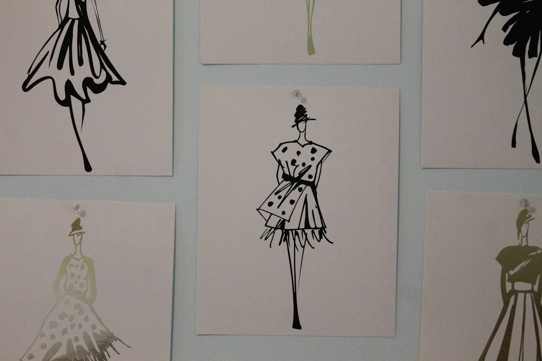
Fashion Flats: Professional Designer Templates provide a comprehensive set of 116 female croquis templates, making them a valuable resource for fashion illustrators. With designs ranging from tops and jackets to skirts and streetwear pants, these templates can streamline the process of creating a cohesive color palette for your fashion illustrations. Utilizing these versatile templates allows you to focus on color and style, enhancing your overall design workflow.
View ProductExplore the world of another Shopify or Wix store owner. Visit their captivating online store. Keep in mind that this is a promotional link, and we are not responsible for the content of the linked store.


Leave a comment
This site is protected by hCaptcha and the hCaptcha Privacy Policy and Terms of Service apply.