Color theory plays a pivotal role in the world of fashion design, helping designers create appealing, cohesive, and innovative collections. Choosing the right color palette can elevate sketches from simple outlines to stunning professional-grade illustrations. In this article, we will delve into the fundamentals of color theory, provide valuable Procreate tips for designers, and recommend essential professional fashion tools that can help enhance your design journey. Let’s explore the captivating sphere of colors and how they can inspire your next fashion project!
Understanding Color Theory
Color theory is the study of how colors interact with one another and how they can be combined to create harmonious designs. It encompasses the color wheel, color relationships, and the emotional resonance that colors evoke. A solid understanding of color theory can tremendously impact your creations, whether sketching by hand or using digital tools like Procreate.
The Color Wheel
The color wheel is the foundation of color theory. It consists of primary, secondary, and tertiary colors:
- Primary Colors: Red, blue, and yellow. These cannot be created by combining other colors.
- Secondary Colors: Green, orange, and purple. These are formed by mixing primary colors.
- Tertiary Colors: Varied shades formed by mixing primary and secondary colors.
Utilizing the color wheel can help you visualize color relationships that can make your fashion sketches more exciting and engaging.
Color Relationships
Understanding the different relationships between colors can inform your palette choices:
- Complementary Colors: Colors opposite each other on the color wheel (e.g., red and green). These create a vibrant contrast.
- Analogous Colors: Colors that are next to each other (e.g., blue, blue-green, green). These provide a serene and pleasing harmony.
- Triadic Colors: Three colors equidistant on the wheel (e.g., red, yellow, blue). This creates a balanced look.
By experimenting with these color relationships, you can discover which combinations work best for your fashion designs.
Choosing the Right Palette for Your Fashion Designs
Picking a color palette is both a strategic and intuitive process. Start by considering the themes and emotions you want to express in your fashion designs.
1. Define Your Theme
Before selecting colors, clarify the theme of your collection. Is it romantic, edgy, playful, or professional? Your theme will guide your color choices.
- Romantic: Soft pastels, earthy shades, and muted tones.
- Edgy: Bold colors like black, red, and metallics.
- Playful: Bright, vibrant hues like turquoise, hot pink, and lime green.
2. Consider Your Target Audience
Think about who will wear your designs. Different demographics may gravitate toward distinct colors based on age, culture, or personal preference. Conducting market research or surveys can provide insight into the colors that appeal to your target clientele.
3. Crafting Your Palette
Once you have defined your theme and audience, it’s time to create a color palette. Here are some Procreate tips for designers:
- Use the color picker: This tool allows you to choose colors from your existing design seamlessly.
- Explore color palettes: Procreate features built-in palettes, but you can also create your own or import from sources like Adobe Color or Coolors.
- Layer adjustments: Adjust colors on layers using blend modes to see how combinations look in real time.
Keep in mind that you don't need an extensive array of colors; sometimes, a focused palette can be more effective in expressing your vision.
Applying Your Color Palette to Fashion Sketches
Now that you’ve chosen your palette, let’s look at how to apply it in your sketches using Procreate.
1. Integrating Colors into Your Sketches
Start by blocking in large areas with base colors. This establishes the framework of your design:
- Create layers: Each area should occupy its own layer for easy adjustments.
- Establish shadow and highlight: Introduce darker and lighter shades to give dimension and depth.
2. Experimenting with Textures
Fashion is not just about colors; it’s also about textures! Play with different brushes in Procreate to simulate fabric textures:
- Watercolor brushes: Great for soft fabric effects.
- Canvas brushes: Perfect for creating textured backgrounds.
- Grunge brushes: Useful for adding a worn effect.
3. Review and Refine
Once you complete your initial sketches, take a step back and evaluate:
- Are the colors balanced?
- Do the colors convey the right emotion?
- How does the design look from a distance? Colors often shift in perception when viewed from afar.
By dedicating time to review and refine, you can elevate your sketch quality and ensure it aligns with your overall vision.
Real-Life Use Cases of Effective Color Palettes in Fashion
Let’s take a look at some real-life examples of successful color palettes used by renowned fashion designers:
The Innovative Use of Neutrals
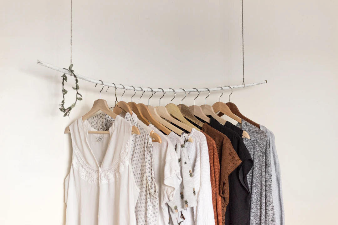
Many designers opt for neutral tones as a base and inject pops of color to create vibrant designs. This approach allows for flexibility and can make the colors stand out even more.
Monochromatic Madness
Designs using a single color in various shades can create a striking visual. Many contemporary collections use monochromatic palettes to convey sophistication and elegance, making it a suitable approach for formalwear.
Seasonal Approaches
Fashion houses often align their palettes with seasonal trends – think earthy tones in autumn and fresh pastels in spring. Staying updated with seasonal color trends can help you create relevant and marketable designs.
Boosting Productivity in Procreate
While mastering color theory is important for fashion design, maximizing your productivity with professional fashion tools is equally essential. Below are tips for enhancing your workflow in Procreate:
1. Create Custom Brushes
Spend some time creating custom brushes tailored to your sketching style. Personal brushes can speed up your drawing process, allowing for unique artistic expressions.
2. Use QuickShape Tool
This tool will allow you to create perfect circles, squares, and symmetrical shapes effortlessly. It’s great for establishing proportions in garment sketches.
3. Utilize Import and Export Features
Procreate allows you to import reference images. Utilize this feature to guide your color decisions and shapes. Additionally, exporting your sketches in various formats will streamline your presentation process.
Embarking on Your Color Journey
Color theory is not just an abstract concept; it's an essential skill that can define the quality and impact of your fashion designs. By understanding color relationships, selecting thoughtful palettes, and applying these principles to your sketches, you can elevate your artistry in the realm of fashion. Remember to explore different color schemes, keep your audience in mind, and leverage powerful tools like Procreate to bring your creative visions to life.
Your journey into the world of color doesn’t end here. Begin experimenting with your palette and techniques today and watch as your designs transform into the breathtaking collections you’ve dreamed of! Dive deeper into the world of fashion design, embrace your creativity, and let the colors tell your story.
Explore another user's Shopify or Wix store by following this link to their store. Keep in mind that this is a promotional link, and we assume no responsibility for the content of the linked store.


Leave a comment
This site is protected by hCaptcha and the hCaptcha Privacy Policy and Terms of Service apply.